Updates from March, 2015 Toggle Comment Threads | Keyboard Shortcuts

  • Tony Pritchard 7:59 pm on March 15, 2015 Permalink | Reply
    Tags: Alison Barnes, Amanda Perry-Kessaris, , Cat Drew, , , , FHEQ, Freda Sack, Hans Dieter Riechert, , Ian Noble, , Joanna Choukier, , , , Paul McNeil, QAA, Russell Bestley, Sheila Pontis, , Susannah Rees, Teal Triggs,   

    Postgraduate Design Education 

    An Introduction to the Postgraduate Level
    Postgraduate design education generally comprises Postgraduate Certificates and Diplomas, Masters and Doctoral degree qualifications. The Framework for Higher Education Qualifications (FHEQ), published by the Quality Assurance Agency (QAA), defines the descriptions of the levels of these qualifications and sets out the characteristics exemplified by typical graduates. These help to inform Higher Education Institutions (HEIs) when developing and designing courses and setting learning outcomes. Master’s degrees are described as a level 7 qualification and the level includes Postgraduate Certificates and Diplomas. The level 7 qualification is one step up from the level 6 Bachelor’s degree with honours.

    Bachelor’s, Master’s and Professional Qualifications
    Defining the distinction between a Bachelor’s and Master’s degree is increasingly a challenge. This is particularly the case given the broadening of the entry profiles of students; the massification of higher education; the diversity of ability; funding restrictions; and individual perceptions. A postgraduate education sees an increase in intensity and level of the complexity of engagement. For many though, the notion of qualification inflation has led to the idea that a MA is the new BA. Some have argued that professional level qualifications such as the International Society of Typographic Designers’ (ISTD) Student Assessment Membership Scheme are as, if not more, distinctive than an undergraduate degree. Former ISTD Chair, Freda Sack, made the case to upgrade the original student Licentiate Membership to full Professional Membership as those passing were showing qualities equivalent to many professionals. The association with an illustrious body, which includes: Margaret Calvert, Wim Crouwel, Geoff White, Derek Birdsall, Vince Frost, Angus Hyland, Roger McGough, Jim Northover, Lucienne Roberts, David Quay, John Sorrell, Erik Spiekermann, Teal Triggs, Freda Sack and Jeremy Tankard, might count for more within the profession and on the curriculum vitae than a BA.

    Blurred Borders and Competencies
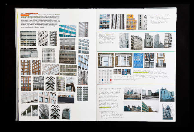
    Dr Russell Bestley has observed the blurring of the borders between the undergraduate and postgraduate levels. He has significant experience of students at both levels and suggests that often ‘a top level BA student is probably more engaged with their process and subject understanding than an average MA student’. Russell isn’t alone in acknowledging the ’emphasis and time [spent] on craft, technical skills [and] the ability to make’ that form the focus of a lot of undergraduate courses. He maintains that ‘postgraduate courses should be able to assume a level of competence from the outset and can then focus more on the hows and whys than on the whats and wheres’. Worryingly there are postgraduate students who are still struggling with the traditional undergraduate competencies at Masters level and this can impede them in reaching that next stage. As an international community of practice we need to consider the variance of acceptable standards within undergraduate education as a root cause and tackle these to ensure a maintenance of quality previously enjoyed. Russell isn’t a keen advocate of the idea of ‘theory’ as something to underpin practice. He prefers to see work that is ‘justified and supported by a good argument and clear, logical research’. He suggests that this can equally be achieved through reading theory and exposure to the thoughts of design writers as well as through practical testing and experimentation’. Below are editions of Visual Research co-authored by Russell Bestley and Ian Noble.

    VRComp

    An Investment in Time and Money – does it pay off and for who?
    A student’s decision to take a year out of employment to study in London (an expensive place to relocate to) represents a significant sacrifice in time and money. The pressure to succeed is both on the student and institution. There is a lot at stake. Some see the postgraduate courses at the London universities as finishing schools for the privileged. Russell Bestley feels particularly concerned for the poorer, equally capable and intelligent potential student. He has good reason to. Having been made redundant in the past, Russell made the decision to return to college as a mature student. He was fortunate as he was eligible for a government grant to support his retraining. Although bright and highly motivated he didn’t come from a traditionally ‘academic’ family background. There will be those of us of a similar age group and disposition that will not only empathise but be eternally grateful for the support we received in the past. How many of us would be able to go to college today if we were in the same circumstances as we were in the past? In Russell’s case there would be no Dr, no Visual Research books (amongst many others) and little documentation of graphic subcultures (his particular area of interest). Although a little troubled over the future for design education he does see the positive developments such as the existence of PhDs in graphic design. He also feels that with the growth of postgraduate design education there is also the possibility for a decent support network of engaged people.

    Applicants to Master’s Study – then and now
    This article considers what motivates people to undertake a Masters in Graphic Design and whether this motivation has shifted. It considers the changes that have occurred over the last decade in terms of the number of applications and the diversity of entry profiles. First we look at two case studies from the past who, though have different motivations, are not untypical of what might be seen as traditional applicants and who are in contrast to the younger applicants we might see today.

    Susannah Rees, Associate Lecturer, London College of Communication (LCC)
    Susannah Rees had taken a 10 year break from full-time work as an editorial designer to work part-time as a freelance designer while her three children were very young. She had been considering ways forward for her career as her youngest child was about to start school. Susannah didn’t want to continue working from home and was exploring the idea of secondary school teacher training when a friend (who was a lecturer at LCC) suggested the MA. A Masters hadn’t been something she had thought of as being ‘for her’. She applied very last minute and started the following week. She felt a renewed excitement to be able to study again a subject she’d loved, in such detail. The level of focus required was something that she had not encountered before and as a mature student the investment both financially and emotionally in undertaking a two year course was a real motivator when it came to the level of effort she needed to put in to creating a successful postgraduate project. Her work was based around design for teaching and learning and moved away from editorial design. Her experience, both with typography and raising her children, enabled her insights into devising educational schemes for aiding parents to assist their children in learning to write. During this period Susannah consulted with handwriting and type design expert Rosemary Sassoon (who had particular expertise working with children). Having the MA enabled Susannah to continue on at LCC as a Graduate Fellow and teaching assistant. She acquired her Postgraduate Certificate in Learning and Teaching to pursue a new career as a lecturer at Higher Education level. Completing the MA wasn’t just about improving her Curriculum Vitae – it was an opportunity to build her confidence and to broaden her practice. Undeniably though, it has led to new career areas that would have otherwise been closed to her. On completing her MA her project was published as a book entitled ‘Write This Way’. In the future she wishes to revisit and develop the ideas that led to her MA major project through into a PhD. Below is Susannah’s project produced as a commercial enterprise.

    Susannah2

    Paul McNeil, Course Leader MA Contemporary Typographic Media, Partner MuirMcNeil
    For over 30 years, Paul McNeil worked in professional practice as a graphic designer. His business was focused on branding and identity with a specialisation in ‘brand communications for the technology and data communications industries’. After several successful years of trading he began to find the commercial environment increasingly constraining and the day-to-day activities had little relation to the aspirations of his earlier years. The particular issue, a challenge faced by many, was in maintaining the balance between finding ‘value in the work produced and running an efficient, profitable business’. The realisation was that he ‘had lost sight of this completely’. Paul explored many alternative options such as architecture or spatial design, before what he calls a ‘life-transforming conversation’ with Ian Noble, then course director of MA Typo/graphic Studies at London College of Communication. Ian was ‘extraordinarily responsive’ to Paul’s aspirations and doubts about his future direction and usefully suggested that Masters’ level study ‘might be an opportunity to fully explore the possibility of new definitions of graphic design as a more profound and long-term cultural practice than a mere service to industry alone’. For Paul ‘the intention to communicate through mark making, is a core principle of sustaining value with a history as long as that of humanity itself’. With this in mind Paul returned, in 2001, to full-time study in order to ‘explore these and similar theoretical and experimental possibilities’, which he hoped would ultimately ‘inform and enrich the quality of his practice’. He continued to run his business albeit in a scaled down, selective way and enrolled on the MA Typo/graphic Studies course. For a mature learner he found it ‘the most terrifying and deeply satisfying year’ of his life in which he was ‘challenged, provoked and inspired by both the tutors and the student peer group’. Since graduating he has made ‘conscious choices’ to ‘work on commercial projects selectively and in partnership’. Additionally Paul writes, teaches and continues to develop typographic research projects of his own. More recently he has established a business, MuirMcNeil, with his colleague Hamish Muir. Their aim is to explore ‘parametric principles in design’ which he translates as ‘the rules and principles of form-giving’. These investigations have been made commercially available as posters and typefaces. In Paul’s words he is ‘so happy to have discovered, quite late, a form of capital that is so much richer than money’. Below is a poster designed to celebrate the launch of Modern Theory.

    Paul2

    A Model for a MA in Graphic Design
    When Russell Bestley and the late Ian Noble were charged with developing and growing a broader MA in Graphic Design at London College of Communication, they took to the challenge with something of a missionary zeal. The period is documented particularly well in the two volumes of the book Visual Research that they both co-authored. On the launch of the second edition Ian typically devised a witty stamp with which to ‘sign’ the books that read ‘try to make more mistakes’. This exemplified the experimental nature of their approach to postgraduate study. Russell likens this to the notion that ‘scientists don’t conduct experiments that they know will work, they try hundreds…of different measured scenarios…to progress their knowledge’. He continues that ‘discovery requires this kind of risk – you don’t know that something doesn’t work until you actually try it’. As the American inventor Thomas Edison once claimed: ‘I have not failed. I’ve just found 10,000 ways that won’t work’. The zoologist and slightly improbably named Marston Bates stated that ‘research is the process of going up alleys to see if they are blind’. It was demanded of students on the course to establish and test their acquired knowledge and information. They had to move their position from thinking to knowing and this is pivotal to Ian and Russell’s Visual Research concept to make a ‘Claim’ then gather ‘Evidence’ to provide Qualification. Russell suggests that designers need to ‘seek out material evidence, to support their assertions and arguments’. He suggests that like a good barrister a designer should be able to ‘argue a position with supporting facts’. This had led to the quip that Russell represents something akin to ‘the logic police’. This thorough questioning of any proposition has led to an MA that includes the notion that a viable outcome may be simply a more focused and tightly-framed proposition: ‘you start with a question and end up with a better question’. In undertaking the running of the MA, Russell and Ian were able to develop their own research agenda alongside that of their students. There was a joint desire ‘to better understand the Graphic Design process itself’. Design as a product and its relationship to technology had become an ongoing exploration for many designers through the 80s and 90s. They now wanted to define and document a fundamental understanding of the inter-relationship between the design research, development and production processes. This gave rise to an awareness of ‘informed engagement’ and how the designer might make ‘more effective design if they were closely aware of their own research methodology and visual research practice’. It was their belief that in the ‘post-modern 1990s, Graphic Design was being ‘colonised by theorists from outside of the practice who were commenting on their interpretation of design approaches without the necessary understanding of the process of design from the perspective of the practitioner’. Russell explains that the shift from the Art School to a University regulatory model of higher education led to the ‘adoption of dissertations to provide an academic validation to a qualification’. These dissertations often ‘focussed on things tangential to the actual discipline itself’. What Russell and Ian wanted to reflect on was ‘how and why we design; how and why some designed things are ‘better’ solutions than others; and how that process to reach ‘better’ solutions might be harnessed and learned’. It was a distinction of this reflective postgraduate model that contextual study was not seen as separated from studio practice. Prior to his untimely death, Ian Noble had moved to Kingston University and was exploring further the notion of flexible delivery within the MA considering progression through a ’step on, step off’ approach that built towards completion via a modular system. Below are a set of word and image combinations created by Russell Bestley and Ian Noble examining the visual communication process of graphic design.

    Detour2

    Acceleration towards Master’s Degrees
    The lack of state or government funding for postgraduate study within the UK has given rise to courses of four or five year durations that integrate the Bachelor and Master’s stages. The traditional entry profile for a Masters would have constituted a period of professional practice prior to application as well as a first degree. The entrant’s purpose and intention might have included a desire to address aspects of their practice through an intense period of study. Having had experience of reading applications to postgraduate courses there is an understandable level of anxiety and concern over employability and the value of only having a purely undergraduate experience and qualification. The lack of professional opportunity within a harsh economic climate might also lead recent undergraduate students to stay on in education. The statement within the FHEQ that ‘much of the study undertaken for Master’s degrees will have been at, or informed by, the forefront of an academic or professional discipline’ suggests a level of maturity and reflection normally expected from knowledge and experience acquired through actual academic or professional practice. Is it possible to achieve this within a limited timeframe of an undergraduate three year period? Will this level of education enable them to ‘propose new hypotheses’ within the subject?

    Essential Skills
    With the withdrawing of funding from higher education design subjects and a climate of full fees there is the danger of educational establishments seeing themselves as purely management run businesses. In the drive to meet target numbers, responsible and ethical recruitment practices can get overlooked. HEIs are caught between a rock and a hard place. On the one hand there are the university estates to upkeep and staff salaries to be paid. On the other hand one needs to ensure that risks aren’t being taken at the expense of the student. This begins to impact the quality of the provision both in terms of academic learning and teaching practice but also the subject discipline. Many are seeing a decline in the level of the basic attributes required of graduates and postgraduate students. Martin Roth, Director of the Victoria and Albert Museum, suggests that ‘UK design education is failing students’ and that too many design graduates are lacking ‘basic skills’. Postgraduate courses are now having to build skills training into their provision to compensate, not just for the shortcomings of UK undergraduate design education, but for this lack in students arriving from abroad. It’s a global design crisis and we are at a watershed moment in considering what the subject and educational values are. Roth extends his criticism beyond technical skills to contextual subject knowledge. In a competitive race for institutions to be seen as ‘groundbreaking’ and ‘innovative’, timeless and enduring knowledge is being compromised.

    Lessons from the Past
    At the Munich ’72 Design Legacy Symposium, a panel comprising Ian McLaren, Hans Dieter Reichert, Lucienne Roberts, Mason Wells and Tony Brook (all who have experience of the profession and education) raised concerns over the undefined notions of what UK students and educators see as ‘creativity’. Wells and Brooks encouraged a more holistic view where the technical and creative are considered in equal measures. Brook in particular reflected upon his company’s increase in employment of non-UK designers in recent years. Could there be something deficient in current UK design education from an employers perspective? With all the ‘advances’ in quality assurance, learning and teaching theory and insightful management what could possibly have gone wrong? Perhaps there are lessons from the past that could be applied to the future – perhaps there are still principles worth adhering to. Below is a poster from the Munich 1972 Olympic Games. Ian McLaren was part of the design team. The poster demonstrates basic design principles such as typography, structure and colour.

    IanMcL

    Academic Culture Shock
    Differences between entrant expectations and that of the welcoming institution can lead to academic culture shock. A postgraduate education is different from an undergraduate one. They are at different levels and there are different expectations. The postgraduate workload is more intense. The amount of self-directed study is increased. There is a requirement for a high degree of motivation. You are expected to have a developed knowledge of the subject and a critical position. Institutions differ not only within a national context but also globally. What passes for muster in one institution won’t necessarily garner support in another. Students should expect a far more critical environment from that which they experienced at undergraduate level. If students wish to study at high profile establishments then they will be expected to raise their game considerably, not only in terms of their design ability, but also intellectually. Given the cost in terms of time and money, applicants really do need to do their research, ask questions and shop around. Don’t just come to London because it’s a cool place to hang out for a year.

    Postgraduate Certificates and Diplomas
    Postgraduate Certificates and Diplomas often have a professional development focus although they can also be used as a bridging study to a Masters course. They are short enough to run in part-time or full-time mode to enable those working part-time or with family responsibilities to undertake flexible study. These types of qualifications provide a step up for those that have been engaging with short courses and would like a period of sustained study leading to a recognised qualification. Progression from Postgraduate Certificates, through Diplomas and onto Masters sees an increase in the level of intensity and complexity of study. Given the nature of applicants to Postgraduate Certificates and Diplomas, in that they are mature students often working and managing family life, there has been much debate as to how academic institutions are supporting the ambitions of these types of people. Many would like to see the notion of stepping on and off the three phases of a Masters being far more accommodated. The credit framework logically suggests this as a viable academic and financial possibility. This would then allow applicants to study at their own pace and within their financial constraints. They could study a Postgraduate Certificate part-time over a year. They could then take a break and earn some money or gain professional practice experience. They would then be able to come back and perhaps study a Postgraduate Diploma for 15 weeks full-time. After successfully completing this, they could then then do a further trade in of their current qualification to achieve a Masters in a final phase of study at the time of their choosing and money permitting.

    Design for Visual Communication
    The Postgraduate Certificate and Diploma Design for Visual Communication courses at London College of Communication were set up to accommodate those progressing from short courses, wishing to engage with a more sustained period of study and leading to a recognised qualification. The course also supports those wishing to progress to Masters study but who haven’t met the entry requirements for the level in terms of their portfolio or application statement. This allows Masters courses to encourage talent where they see it but where it is still under-developed. These courses introduce design research methods to compliment the students original academic research abilities. Design principles are examined from the fundamentals up. These include: Type Classification; Typographic Hierarchy; Colour; Visual Language and Grammar; and Information Design. The related theoretical underpinning is delivered within the practical studio sessions so that theory and practice are integrated. As the late, great, Ian Noble once commented: ‘it’s the theory of practice and not the practice of theory’. Professor Teal Triggs, Associate Dean at the Royal College of Art, has commented further that ‘theory doesn’t make you a better designer rather a more informed practitioner’. Through reflective learning this is the aim of professional development at postgraduate level. Further units consider the academic and professional contexts and enable a degree of self-determination. London College of Communication is an institution that had the vision to maintain its analogue facilities whilst developing its digital provision. Students now can benefit from mixing analogue and digital techniques to develop new visual languages supporting their conceptual development. Most postgraduate design courses complete the academic session with a major project. This begins with a period of project exploration to develop a design research question. Students coming from other academic disciplines and previous text-based subjects tend to research as if they are going to write an essay. Design students adopt some of these traditional primary and secondary research techniques, but are to apply critical analysis alongside practical visual testing. The project will have to be transformed into a visual outcome. A good design research question contains the design area (typography, information design, editorial design, etc); the focus of the project; and the intended audience or user. This will clarify the intention and purpose of the project. The image below is by Laura Rooney and is a letterpress cover produced by Mirabel Fawcett and Vanessa Wong.

    Laura

    Who is Studying Postgraduate Professional Development Design Courses?
    Applicants to the Postgraduate Certificate and Diploma Design for Visual Communication courses come from diverse cultural, social, professional and academic backgrounds. For some it is a return to a first love having followed parental, peer or academic pressure to pursue a traditional university subject. Having realised that life is longer than three years, and often feeling trapped in an administrative role, the course provides another roll of the dice. The course is home to a truly international cohort: from Canada to Russia and all the countries in between. Students have previously been involved in: geography, linguistics, opera, acting, rugby, genetics, history, fashion and product design amongst many other disciplines. They go on to set up shops (LMNOP Shop in Brighton); record labels (Default Position); work freelance; write and edit books (Valentina D’Efilippo: The Infographic History of the World); and join high profile agencies such as Bibliothèque, Sea Design, Unit Editions, Design Council, Intro and Information Is Beautiful. These are the typical career converters who desire professional up-skilling. Another group wish to acquire the academic skills to enable them to progress onto Masters study. Tim Molloy, who was Head of Creative Direction at the Science Museum, described Design for Visual Communication as a foundation course for postgraduate study. It has often been thought of as the unofficial year one of an MA. There is a new third strand of postgraduate applicant emerging. As notions of graphicacy join the traditional academic skills of numeracy and literacy, other disciplines, professions and organisations see visual communication as vital to their future functioning. Below is Valentina D’Efilippo’s co-authored book The Infographic History of the World.

    info-history-of-world-cover

    Two Case Studies of the New Postgraduate Design Applicant Profile

    Cat Drew, Senior Policy Advisor to the Home Office, Head of Police Digitisation Delivery and Policy Design Lab
    Cat Drew is Senior Policy Advisor at the Home Office. Her main interest is in data visualisation and she would like to take forward the transparency agenda by visualising and therefore making accessible the large amounts of data that Government and public services are now making available, so that citizens can properly hold the state to account. Cat has been asked to work for Policy Lab which is the Government’s new creative space that takes design practices (e.g. ethnography, prototyping, service user journeys, data science and visualisation and behavioural economics) and apply them to public policymaking. As Head of Police Digitisation Delivery in the Home Office, Cat has brought Surrey and Sussex police together with Policy Lab to do the first Lab project around designing a better online reporting and investigation service for the public. Whilst studying on the Postgraduate Certificate in Design for Visual Communication, Cat devised a stop and search website as well as an investigation into Dalston’s gentrification. She is now undertaking her MA in Graphic Design and has been looking at ways in which design can engage Dalston citizens in the promotion and creation of connections between others in the area. She wants to take Dalston Bridge beyond just fundraising connections and promote and create other sorts of connections in the area as the neighbourhood gentrifies. Cat has already produced a prototype where she designed luggage tags and asked people to fill in one side with what Dalston had given them, and then what they would give to Dalston on the other side. These were then hung up in the Dalston square so others could interact with them. Below is Cat’s proposal for the Home Office Stop and Search website.

    SS5

    Amanda Perry-Kessaris, Professor of Law, Kent Law School, University of Kent
    Amanda came to the Postgraduate Certificate Design for Visual Communication course with no prior experience in visual methods. Her overarching objectives in relation to the course are to be able to produce visualisations for her legal research, and to bring visual communication to the attention of her colleagues in legal academia. Amanda plans to use her visual grammar project to teach undergraduate students about differences between legal principle and legal reality; to create a 3D model to demonstrate the meaning of the term ‘critical perspectives on law’; and to run a workshop helping legal academics to visualise a quotation using typography and collage. Amanda identifies graphic design as a multi-faceted and evolving field of thinking and practice. She has been especially interested in tracking two tensions inherent to the discipline: designer versus author and commercial versus ethical (as seen in the First Things First manifesto) and more commonly, in the tendency for designers to produce self-authored pieces. These issues have huge resonance for her as an academic who both wants to be in control of how her research looks, and is troubled by the awkward relationship between research and consultancy work. She sees much productive thinking to be done about what designers and legal academics can learn from each other in this respect. In Amanda’s own words, she is ‘learning to look’. She has formed the habit of systematically and critically analysing both self-consciously produced designs, and the general visual environment. An invaluable consequence is that she is developing (greatly aided by participation in resources such as blogs) the ability to offer, receive and respond to, feedback, all of which are crucial to further progress. The impact she sees as already clear in her work as a legal academic. She has introduced short tasks ending with pin-up critiques into a PhD Research Methods course. She is able to give feedback on use of colour and typography in slides and posters, and to help students to give each other feedback. She has also added a compulsory blog component to a new Masters level module. Below is one of a series of images by Professor of Law Amanda Perry-Kessaris to provoke discussion on different aspects of law.

    Amanda

    Doctoral Degrees
    The FHEQ define doctoral degrees as ‘the creation and interpretation of new knowledge, through original research…of a quality to satisfy peer review [and] extend the forefront of the discipline…’. To paraphrase Dr Russell Bestley you become an acknowledged specialist researcher and expert in the chosen field. Russell goes on to state a ‘PhD is a qualification that acknowledges the ability to research – it is not a qualification on the specific topic or subject under investigation’. He suggests that the purpose of the qualification is ‘to measure the effectiveness of the [researcher’s] methods and their argument, validated through a structured and logical body of research’. Russell continues that since all PhDs are by definition in some way unique then ‘the system to measure success or otherwise needs to be transparent and able to be applied across disparate subject fields and methods’. When asked about the notion of practice-based PhDs he offers a note of caution. ‘The danger in rewarding practice for practice sake’ he suggests ‘is similar to some Art PhDs – just because something is very well produced and worthy doesn’t mean that it is a contribution to knowledge that is transferable, understandable and repeatable’. Russell isn’t wishing to perpetuate the idea of exclusivity or elitism. He goes on to state ‘Hitchcock never got a PhD. Picasso never got a PhD. It doesn’t mean that they were not brilliant at what they did’. A PhD needs to be able to describe the innovation or knowledge being established to others ‘so that they can learn, repeat or adapt this for themselves’. Russell concludes ‘I like the fact that knowledge in this way is a kind of communal thing, not something for individual geniuses to possess – the PhD is a small addition to the greater pot of knowledge’. The Times Higher Education website recently asked: ‘Who would do a PhD [given the sacrifices]?’. The Higher Education Statistics Agency answered ‘quite a few’ given that the UK has seen a 50 percent increase in people obtaining PhDs over the last 10 years. There is little to suggest that a PhD on the CV will necessarily lead to a burgeoning academic career despite that being an initial motivation for some. There is a developing appreciation of PhD level study within certain ‘research-active’ companies like Google which may suggest an alternative pursuit within commerce for post-doctoral researchers. Either way the five case studies within the Times Higher Education article suggests a PhD is not something that is for everyone and shouldn’t be undertaken lightly. Some responses to the article suggest that a degree of maturity, knowledge and experience have advantages if not being necessary requirements. Although the Times Higher Education suggests that academia is ‘a career for which vacancies were never more oversubscribed’, a PhD level qualification is now being added as the requirement for Senior Lecturer posts. Whilst this is a legitimate desire, some caution needs to be practiced in that this doesn’t narrow the diversity of teaching staff and their alternative life experiences and expertise. As indicated within this article there are specific reasons for undertaking a PhD. A PhD shouldn’t be downgraded through qualification inflation to the idea of a minimum level requirement. This could encourage the not so well motivated intention for undertaking a PhD. Darren Raven who studied at the Royal College of Art and is Senior Lecturer at Staffordshire University is undertaking a Doctorate in Education (EdD). He suggests that there is more of a tradition within other disciplines (outside of art and design) of the progression from undergraduate degree to PhD to Lecturer and then to Senior Lecturer. Perhaps with the traditional Art School being absorbed into the University structure there is this additional pressure to conform. Darren questions whether the driver for PhDs within art and design might partly be due to meeting Research Assessment Exercise (RAE) targets; HE league tables; and student satisfaction surveys. He likewise cautions that higher education managers need to act responsibly within their staff recruitment to preserve the richest possible selection on offer to students.

    Joanna Choukier
    Joanna Choukeir is a social design practitioner, researcher and educator. She is the Design and Innovation Director at Uscreates, a London-based strategic consultancy pioneering innovative work to help organisations maximise their social value. Joanna is currently in the process of completing a PhD at the University of the Arts London (UAL). The research is based on developing communication design methods to enhance social integration in post-conflict communities and takes the experience of the youth in Lebanon as a case study. She is an active user of social media communication to further the messages she cares about passionately which includes the current ongoing conflict in Gaza. Previously Joanna completed a BA in Graphic Design at Notre Dame University Lebanon in 2003 and a MA in Graphic Design at LCC in 2008. Her purpose in undertaking an MA was to explore new opportunities and practices within socio-political design. The MA afforded her the time and discipline to investigate her major project theme. On completing her studies she was able to enter the related sector of the design profession. This involves social design interventions to tackle social challenges mostly faced by public sector organisations in the UK for example health, wellbeing, education, employment and housing. Her aim would be to work with the United Nations to help them use design and innovation on their change programmes globally. Joanna is what Dr Russell Bestley refers to an an ‘engaged practitioner’ and she encourages designers to question routine approaches and ask themselves why or how they could be doing things better. She is concerned when designers disconnect themselves from the purpose of design and what it is they are trying to achieve. Her advice to anyone considering an MA would be to ‘think about your goal and where you want to be before you join a course, then use your time on the course to help get you there’. The desire to undertake a PhD arose from an insight from her MA research which opened a range of broader questions about social integration in Lebanon. She felt this could be addressed within ‘the structure and discipline of PhD research’. Joanna describes three strands within her operations, that of ‘keeping an academic hat, a practitioner’s hat and a lecturer’s hat on’. It is these three areas that help her ‘best engage with the design discipline’. A part-time PhD allowed her the flexibility to do this while still working and teaching. Joanna agrees with the observation that a Masters is more structured whilst a PhD is more self-directed. She describes an MA as being ‘more about a journey of discovery and experimentation’. Joanna continues: ‘with a PhD…one has to have a very clear focus and sense of purpose and a great passion for the research subject to sustain [the necessary] efforts and contributions for 5+ years’. A PhD has an increased level of rigour ‘requiring the researcher to fully explore the theoretical, historical and contemporary landscape of their field of study and identify a genuine and valuable contribution to knowledge’. Joanna suggests that often one undertakes a MA to support personal growth, whilst PhD research equally supports the growth of other researchers and practitioners working within the related field of study. She believes PhDs in design are vital and that ‘rigorous, evidence-based research on the value and contributions that the design discipline has to offer are scarce’. Joanna is committed to the idea that ‘there is a need for more research to make the case for design socially, economically, culturally and environmentally’. Although Joanna firmly believes in the contribution of PhD level research for academic institutions and society she also feels that ‘it’s important for a design researcher to keep practicing design as much as possible and immerse themselves in the discipline they are researching’.

    Sheila Pontis
    Sheila Pontis describes herself as being involved in three design spheres: education, research and practice. She teaches design principles such as information design and typography across a range of institutions. Her research primarily focuses on the ‘sense-making of visualisations of large data sets’. Her practice involves consultancy and project management of editorial and diagrammatic work. In 2008 her ‘passion for complex diagrams and information design’ brought her to London to complete a PhD. Prior to her PhD, Sheila undertook a MRes and MPhil. She states that in a Masters programme ‘the research process was more structured and contained as there was a specific timeframe in which the project needed to be completed’. Her PhD, however, went through a ‘much longer and organic process’ – it involved more independent decision-making. For Sheila it was fundamental to have a good supervisor and describes this as ‘the most important part of the process’. She sees undertaking a PhD as ‘a very personal decision’ and focused on her emerging subject interests related to her professional development. Initially, she wanted to expand her ‘understanding of designers’ thinking process, and also better understand the “why” behind some design decisions and solutions’. Beyond this it has helped her develop alternative perspectives on theories and models and to establish connections between the not-so-obvious aspects. The process has developed her critical thinking and realisation of supporting ideas with data. She still believes though that this ‘objectivity’ should be balanced with a desire and confidence to follow her instincts. Sheila’s view is that ‘research in the design discipline is still at an early stage in comparison with other disciplines such as Human-Computer Interaction’. This sometimes can provide a difficulty in seeing a ‘clear and direct connection’ between the academic theory and the professional practice of design. Looking back there were times when Sheila felt her PhD experience to have lonely moments. She appreciated working with other PhD students even if that was just by sharing a space and project findings. She is critical of some aspects of the PhD process: ‘it was tough in the sense that when I started mine there was even less structure and clarity about the whole process, and that made some phases tougher than they should have been’. She feels that the challenge of a PhD is better resolved when there is ‘a supporting research community’.

    Alison Barnes
    As with other mature students, Alison had arrived at a point in her life where the usual challenges of work were waning and felt a desire to explore something on a personal basis. She had been thinking for sometime of relocation to Australia and realized that a PhD would be a job requirement: ‘professionally it is clearly the way Higher Education staffing is going’. Her previous MA had engendered her excitement of research-based design. She defines the key differences between the MA and PhD as having to engage with and understand what research methodologies were and ‘how research design needs to be constructed and framed’. On reflection she feels that ‘we [don’t] prepare design students at all well for this’. Alison’s MA and ensuing PhD both were connected by psycho-geography: ‘for me the PhD was an extension to the Masters, and I guess it was important both personally and professionally’. The PhD was a particular challenge for Alison. From an early age she sensed that others may have questioned her academic abilities, she reflects: ‘getting the highest qualification was effectively two fingers up to those who had destined me to achieve nothing’. As with another case study in this article the role of the supervisor is emphasized: ‘I was lucky to have a Professor of Geography from Queen Mary University London as one of my supervisors and I can remember her asking me to write something early on about my methodology’. It was this experience that focused her attention on the lack of research thinking within design education. She felt her MA was a life changing experience but that research was not articulated in a fashion that considered qualitative methods and research design in such a formal way. In design there is a tendency to design the project then write about it afterwards. Not wishing to pass on the blame she does admit that this could have been her own lack of insight. She would be keen to see more emphasis put on ‘Research with a capital R’ both at undergraduate and Masters level in the UK. Alison comments that ‘to have three years to delve into really interesting reading that inspires your thinking, making and writing is quite an incredible opportunity’. She believes that designers need to be taken more seriously in terms of their research capacity and ‘that the old notion of a service-led profession is really a disservice in terms of what designers now often do and are capable of’. From her experience ‘post PhD is a difficult [landscape] to negotiate’, she has returned to teaching but wishes ‘to develop a more research focused career’. Alison concludes ‘that although we are encouraging more PhDs in Design, the post doctoral and research focused positions aren’t there to further develop this territory’. Below is Alison’s map of graffiti in New Basford, Nottingham.

    tumblr_ljsex2yddB1qj6r7so1_1280

    Conclusion
    Although this article has been critical of some of the emerging conditions of postgraduate design education we are equally at an exciting watershed point of potential change. Despite increasing numbers, if HEIs can stay focused on providing a high quality education then an increase in the number of well-educated designers could be a positive outcome. Courses need the support of their management in genuinely maintaining an appropriate level of provision. Teachers and their students need to remember the original purpose of their intentions. PhD level design research is putting the subject discipline at the forefront of contemporary discussion. Other subject disciplines as well as government departments see design as integral to future developments and policy making. Design is respecting its roots and discovering new branches with a strong central core of knowledge and practice. Despite rising tuition fees and the attendant pressures experienced by students, staff and institutions, now is a good time to be studying design but do your research before buying your design experience and make the most of your time and available facilities.

     
  • Tony Pritchard 10:48 am on August 12, 2014 Permalink | Reply
    Tags: Data Visualisation, , , , , , , , Timeline, , ,   

    Information Design and Data Visualisation 

    This video attempts to show and explain aspects of Information Design and Data Visualisation as explored by the Postgraduate Certificate and Diploma Design for Visual Communication courses at the London College of Communication. The purpose of designing the visual representations of information is to make the communication more accessible, understandable and useable. This often means dealing with complexity and attempting to clarify meaning. It could be said that information is dead until it is read. A balance between clear communication and a visually engaging design needs to be struck.

     
    • Carina Marano 8:53 am on October 15, 2014 Permalink | Reply

      This independence of the coursework for the Postgraduate Certificate Design for Visual Communication at the London College of Communication makes it ideal for an online program. Is there any possibility it would become available online, specifically for students studying abroad?

      • Tony Pritchard 4:27 pm on October 18, 2014 Permalink | Reply

        That’s an interesting proposition which I raised with my programme leader at college. How would you see it working for you? Set projects? Video demonstrations/tutorials? Skype? Do you have any examples of practice you could point me in the direction of?

        • Carina Marano 11:28 pm on December 26, 2014 Permalink

          Two programs I’ve had experience with are Brandman University https://www.brandman.edu/ and Academy of Art University http://www.academyart.edu/. Brandman uses the Blackboard online system in which course work is divided by weeks and comprises of discussion threads, set projects, readings, and multimedia instructional aids such as videos. Academy of Art has an additional feature in their discussion threads that allows for marking and commenting on uploaded artwork for critiques.

          In addition, meeting features such as using Adobe Connect or Go To Meeting are helpful to discuss larger projects and facilitate small group work. I’ve seen this utilized every two weeks for 8 week courses to great effect.

          For a program like Visual Communication, I would recommend set projects with independent readings and video introductions, along with discussion forums to post to while the projects are in progress, and live meetings for critiques and follow up questions. There could be also be more live, but perhaps less formal interactions in the beginning and throughout the projects, such as video Skype office hours, or scheduled live chat sessions.

          The most successful online programs usually breakdown the coursework into smaller milestones throughout the class in order to assess that students are on track and are understanding each step of the process. This is in lieu of regular face to face meetings where the instructor can visually see the progression of work.

    • Tony Pritchard 8:11 am on December 29, 2014 Permalink | Reply

      Thanks for taking the time to write this. My DVC course (http://www.arts.ac.uk/lcc/courses/postgraduate/pg-dip-design-visual-communication/) uses Moodle as essentially an information repository for things like projects, handbooks, handouts, etc. We compliment this with a group blog where thoughts, images, movies, etc can be posted and discussed. We are still very much a face to face course though.

    • daniele 10:18 am on February 12, 2015 Permalink | Reply

      Very well done on this set of new videos!! They are amazing!

      • Tony Pritchard 11:27 am on February 12, 2015 Permalink | Reply

        Thanks Daniele – just visited your site and am impressed by the Typographic Hierarchy poster. I’ll post on my Twitter page

        • daniele 11:41 am on February 12, 2015 Permalink

          Oh wow! Thanks for visiting and for posting! Honoured to be featured alongside all that great work!

  • Tony Pritchard 9:29 am on August 2, 2014 Permalink | Reply
    Tags: , , , Design Research, Design Theory, , , , Sketchbook, ,   

    Sketchbooks 

    These two films look at how Henrietta Ross and Cat Drew developed their sketchbooks. Too often we look at the finished items and not the process that led to the resolution of projects. Henrietta and Cat take you through how they documented, contextualised, experimented and evaluated their work on the Design for Visual Communication course at the London College of Communication. Those new to visual communication from other disciplines or a text-based education might find these films useful in understanding this part of the design process.

     
  • Tony Pritchard 1:29 pm on September 21, 2013 Permalink | Reply
    Tags: A M Cassandre, Alan Fletcher, Global Design Forum, Kanye West, Paul Morley, , , Pop Music, Record Sleeve Design, V&A, Victoria and Albert Museum, Yves Saint Laurent   

    Peter Saville Review 

    Peter Saville

    Here is my review of designer Peter Saville in conversation with music journalist Paul Morley at the Victoria and Albert Museum on Monday 16 September 2013. He discusses meeting Kanye West, working with Manchester City Council, Factory Records and more in a two-hour conversation with Paul Morley. Expect the unexpected! The image is courtesy of Global Design Forum.

     
  • Tony Pritchard 5:39 pm on April 13, 2013 Permalink | Reply
    Tags: Adrian Shaughnessy, , Browns, Cargo Collective, CERN, Conversion Courses, Design Council, , Fallon, Flickr, Frost, , Indexhibit, , Intro, , Malcolm Gladwell, Michael Johnson, Norman Potter, Professional Development, Represent UK, Richard Holt, Robert Fripp, Sea Design, Shillington College, Short Courses, , Thomas Edison, Unit Editions, Vimeo   

    How to be Good at Graphic Design 

    Introduction
    This post consists of a series of short written pieces that offer advice on how to improve your graphic design abilities and build your confidence. It is aimed at potential students of design. This article is interspersed with work from graduates of the Design for Visual Communication (DVC) courses at the London College of Communication (LCC). These graduates are from non-design backgrounds and have studied visual communication for one year. The course is focused on developing skills and confidence in graphic design.
    The following three images are taken from Susanna Foppoli’s sketchbook and demonstrate the DVC course concept and research mantra: Document, Experiment, Contextualise and Evaluate.

    0 Susanna Sketchbook 1 0 Susanna Sketchbook 2 0 Susanna Sketchbook 3

    Context
    This post is in response to a discussion thread on Richard Holt’s blog. The discussion centred around an advert Shillington College had placed with the copy line: Learn Graphic Design Fast. Shillington College was established by Andrew Shillington in 1989. He was experiencing difficulty in finding graduates who had the attributes he thought would make them employable. He was seeking people with ‘high-end computer skills, a practical knowledge of design theory and [who] could meet challenging deadlines’. A full-time course at Shillington College lasts three months. It should be noted that I am writing this piece from the context of my knowledge of the mature learner, converting career, who has already studied at undergraduate level.
    The publications below are from Valentina Verç, Siobhan Hickey and Philippa Thomas. They are visual summaries of research and development work in a designed form that enables the student to reflect upon their design process and research interests.

    0.1 Valentina Visual Summary 0.1 Siobhan Visual Summary 0.1 Phillippa Visual Summary

    Learn Graphic Design Fast
    Shillington’s claim of ‘Learn Graphic Design Fast’ is certainly a great provocation and one that has designers and design educators hot under the collar. It also plays into the anxieties that twenty or thirty-somethings often have – the last chance saloon or the last roll of the dice. Maybe if you take this course or that course one’s fortunes will change. It’s the dream every aspiring creative person has. We see it on the talent shows. How do you become ‘better’ and get noticed quickly? At its heart there are some good questions. How fast can someone learn anything? What are the essential principles that need to be learnt? What are the learning and teaching methods that can facilitate this? Where best to study and how much will it cost?
    A fundamental skill of graphic design is typography. Typography engages with its form but also attempts to provide text-based information. This exercise is primarily concerned with typographic hierarchy. It uses one typeface with changes of size and weight to gain emphasis for the different parts of the information. These examples are from Linne Jenkin, Peter Carr and Tom Hornby.

    1 Linne Typographi Hierarchy 1 Peter Typographic Hierarchy 1 Tom Typographic Hierarchy

    A Journey Not a Destination
    Design can be defined as a plan or intention before something is produced. In his book ‘What is a Designer’, Norman Potter begins by stating that, ‘every human being is a designer’. Potter elaborates upon this point but it suggests that the potential lies within each of us to communicate visually through design. Potential is the key word – is this a road you want to travel down? For me, design is more a journey than a destination, a process not just an end product. Someone better than I once commented that ‘typography is a lifelong apprenticeship’ – you don’t really ever master it, you pursue it. My design hero, Geoff White, is a good example of someone who has made it a lifelong pursuit and is still grappling with it in his mid-eighties. I do think that the mechanics of typography can be learnt in the first term (approximately three months) on a full-time undergraduate course. Cultural and historical studies should enable you to root yourself in the tradition and continuum of the subject. Learning the software is also very much part of the deal. I believe you can become a functional designer quite quickly though. What is harder is learning design judgement – being critical and selective. You do need the time factor to practice, try things out and experiment. But then be critical. You need to find your attitude as a designer. I think it has to be something you feel and have an emotional connection with. It combines the cerebral with the visceral. It is a lifelong journey and not just three months.
    In order to make an informed choice when selecting a typeface, students on the DVC course undertake a project exploring typeface classifications. These examples are by Sateen Panagiotopoulou and Dorota Zurek.

    2 Sateen Type Classification2 Dorota Type Classification

    Am I Talented?
    Many see design as a talent that is nurtured and not something that is learnt fast. You either have an eye for it or you don’t. The notion of talent is something of an intangible. Talent is described as a natural or innate ability. This might suggest that it is something that can’t be learnt or developed. Universities annually recruit cohorts of students. Despite the selection process it isn’t easy to spot the talent. The person who looks promising in the first year can decline over the next two years. Equally that hopeless case in year one suddenly begins to shine in year three. Who can predict an individual’s trajectory over time? Talent spotting seems a somewhat futile and undesirable activity. Can design be learnt? Yes. Can it be taught? Yes. Is design about the ‘Eureka moment’ or a ‘bolt of lightening’ providing inspiration? No, not always, rarely does inspiration strike out of nowhere. It’s not that random. The design process can be explained and it can be understood. It can therefore be taught and learnt. I have run courses for those converting career or wishing to add design as a complimentary skill to a repertoire of other skills they possess. The desire to learn graphic design might be because it was a first love that lost out under peer or parental pressure when choices were made regarding what subject to study at university. It might have emerged from engaging with design in a related area such as promotions, marketing or information visualisation within employment. Those individuals will have identified their ability and wish to validate and develop that ability through a formal education process.
    The visual language and grammar project looks at basic form in the abstract but also how it is perceived in the visual world around us. These examples are provided by Dorota Zurek and Henrietta Ross.

    3 Dorota Visual Grammar 3 Henrietta Visual Grammar

    Talent and Success
    Many ‘talented’ graduates make the assumption that to be ‘talented’ within your subject is enough. The world will love you for that very fact. Your dream clients will beat a path to your door. Commercial success and talent are not related. Business acumen is a talent in its own right. Not all designers have this as a natural skill. The perception of your talent isn’t a static thing. One educational establishment might lead you to believe that your talent is unquestionable. Another turns that on it’s head. Your first interview at a design agency doesn’t go as well as you expected and dents your confidence in your talent. Fashions change, you might be in one minute and out the next. Design as style can be fickle and your success within a particular idiom fleeting. You can’t give up because the rewards aren’t immediate or circumstances change.
    Colour is a fundamental way in which we interpret the world. It has strong cultural, political and social connotations. This project introduces eight aspects of colour theory which enables the students to make sensitive choices when combining colour. The project is in the form of a storyboard for an animation targeted at first year design students. These examples are by Bethany Wood and Margot Lombaert.

    4 Bethany Colour 4 Margot Colour

    Ninety-nine Percent Perspiration
    Thomas Edison is attributed with saying that ‘genius is one percent inspiration and ninety-nine percent perspiration’. This suggests that sheer hard work is as important as the chance gift of a talent. David Quay commenting on type design suggests that ‘[it’s] one percent greativity (that was a nice mistake)…creativity and ninety-nine percent production’. Edison also said ‘many of life’s failures are people who did not realise how close they were to success when they gave up’. Perseverance in the early stages of learning anything is key. My experience of teaching mature students has led me to believe that a highly motivated person who works persistently hard eventually succeeds. It doesn’t require genius or that undefined notion of what talent is. Success though is relative. When I taught at undergraduate level I often defined success when a failing student finally passed. My colleague David Dabner use to award a ‘distance travelled’ prize, not to the highest achiever, but for the student who had come the furthest. Design isn’t easy. It takes a lot of hard work. More often than not you get it ‘wrong’. It requires perseverance through hours of trial and error.
    The information design project enables students to bring together image, colour, typography and structure to convey complex information in an understandable form. In the first example Lizzie Toole analyses the contents of a humble tin of beans. The second example by Siobhan Hickey celebrates 50 years of Bond movies. Each segment represents a film, the green areas are the number of villains killed per film, the red dots – Bond’s amorous conquests. The final example sees Tom Hornby using Processing software to map out data relating to every station and stop in Britain. Imagine if this was an animation showing the growth of Britain’s transport infrastructure over time.

    5 Lizzie Information Design5 Siobhan Bond Infomation DesignMap-WonB-560x760_2

    The 10,000 Hour Rule
    Malcolm Gladwell in his book Outliers introduces the ‘10,000 hour rule’. This is the minimum number of hours Gladwell claims his case studies put in before becoming successful. His case studies included Bill Gates and The Beatles. Paul McCartney, commenting on Gladwell’s theory states, ‘when you look at a group who has been successful… I think you always will find that amount of work in the background. But I don’t think it’s a rule that if you do that amount of work, you’re going to be as successful as the Beatles’. Type designer David Quay with typical humour quipped: ‘The 10,000 hours for me…does not work, you have to spend your whole life doing it to be better! But there is this moment when you feel competent enough (that was yesterday!)’. Michael Johnson observes on behalf of the design profession that ‘it [success] doesn’t happen over night and short-circuiting the process rarely works’. Whatever your definition of success, it is unlikely that there are any guarantees of quick routes through to that success.
    The Professional and Academic Contexts project allows students to examine an aspect of structure related to the urban environment through an A3 publication. Dorota Zurek considered the plight of the Aylesbury Estate in SE17; Jason Aquino looked at how our perception of structure is influenced by lighting conditions; musician Lillias Kinsman-Blake explored sound and the city; and Peter Carr documented the re-appropriation of space by parkour exponents.

    6 Dorota PAC 6 Jason PAC 6 Lillias PAC 6 Peter PAC

    Giving yourself the best chance
    There are factors that you can put in place which give you a better chance of succeeding: hard work; long hours; personal commitment; motivation; sacrifice; access to good teaching; genuine passion for the subject; learning basic design principles; knowing basic design theory; learning design history; reading about the subject; keeping up-to-date with developments; participating in design events; and attending exhibitions and conferences. Adrian Shaughnessy suggests the following as key qualities for designers: cultural awareness; communication skills; integrity; tenacity; risking failure; and cussedness. His views on tenacity are worth further investigation: ‘this is the ability to keep working at a task until it is right rather than settling for the first idea that appears’. Don’t settle for being just OK. He believes that these attributes are best acquired through ‘living and doing’. You can read all you want and take as many taught lessons as you like but living and breathing design, not as a chore, is how you become a designer. You don’t switch it on and off. Ultimately there are no formulas or tick box menus. It’s a life commitment you make with little guarantee of return. To paraphrase the musician, Robert Fripp, you pay the bill up front before success arrives. It takes faith.
    In her final major project Henrietta Ross considers the contemporary form of the book and its ability to mimic aspects of the internet such as hypertext links.

    7 Henrietta MP

    The Ideal Candidate
    The graphic design recruitment agency, Represent, asked a number of leading design studios what they looked for in a prospective employee – who was their ideal candidate? It shouldn’t come as a surprise that agencies employ people and not just the portfolio. What is it that makes you unique? Have you studied more than one subject previously. Do you have unusual skills or talents? Can you speak more than one language? How could you target more selectively? If you have studied architecture before visual communication maybe graphic design agencies that have a focus on environmental graphics would be worth consideration. Once you have targeted the agencies you are interested in, research the specifics of the agency you are applying to. Imagine how you would feel if someone had taken the time to find out more about you.
    Jason Aquino explores the relationship between nutrition, food types and their relationship to the body’s vital systems. This piece proposes an exhibition with dynamic interaction.

    7 Jason MP

    Right Place, Right Time
    You can do everything within your control but success still eludes you. There is the element of luck and chance to contend with – the being in the right place at the right time. You can still do something about this. It does mean being outgoing and making an effort. Attend workshops, exhibitions, lectures, etc. Those chance happenings are out there and waiting to happen. Those students of mine that have done this and chanced their luck and spoken to the people who they wanted to work for managed to make a connection. Where there is a genuine connection and you have the evidence to back your interest then your luck might be in. The message is stop hiding behind your computer and get out there and get involved.
    Lillias Kinsman-Blake examines how graphic imagery can renew the case for feminism in the 21st century. This iconic image makes the point that America has still yet to see its first female president.

    7 Lillias MP

    Promote Yourself Online
    Are you making the most of free online resources? It takes time for the search engines to find you. Think and plan ahead. Get involved in online discussions. Keep a blog – on the Design for Visual Communication course we often describe a blog as a digital sketchbook. Finished work can be displayed on resources such as Flickr and template websites such as Indexhibit or Cargo Collective. If you are experimenting with moving image why not set up a Vimeo account? All these resources become places that you can point people towards or be discovered on. If you Google yourself, how many times do you come up on the front page?
    Festival Director Utkarsh Marwah proposed the use of image projection and interaction as a method of engaging audiences with the content of performances.

    7 Utkarsh MP

    Short Courses
    Short and intense courses can help in providing a community of like-minded people which is motivating. It can provide you with technical and subject skills. Then you are left with you the individual. I’m fascinated by those that seem to ‘get it’ quite quickly and those that struggle. People just take different amounts of time to absorb information and use it. I do think most people have the capacity to learn and understand design. A ‘good’ teacher should be able to explain in a way that helps the student to understand. You should also be able to look at ‘good’ examples and learn from those by analysing why others think they are good. Colleges help to contextualise this for students by explaining the theory that underpins the practice. This makes you a more informed and rounded designer. It provides you with reference points and a language to articulate your ideas on design.
    Oxford graduate, Venetia Thorneycroft reclaimed Freud’s Book Of Dreams for the creative community in a production that Scott House, who produced it, described as the most complicated book ever.

    7 Venetia MP

    Communities of Practice
    The advantage of traditional colleges and universities, such as LCC, is that they have good analogue and digital facilities as well as extensive libraries. You get a very hands-on experience of historical and contemporary processes. They are highly motivating communities of practice. It’s the reason why I teach there. The two courses I run are PgCert and PgDip Design for Visual Communication. We teach the fundamental design principles (visual language and grammar; typography; colour; and information design). We teach design theory alongside, and not separate from, design practice. We take an integrated approach. We teach the necessary research and development methods to engage with the design process. We provide opportunities to apply the learnt skills to conceptual projects. We do this over a year both in part-time and full-time mode. Graduates have gone on to work at places such as Frost, Spin, Browns, Unit Editions, Fallon, Intro, Design Council, Sea Design, BBC and CERN. They have been published, set up their own companies and even opened a shop. You can read about the courses and see student work at the LCC course website. Here’s our 2012 publication. Here’s our 2013 publication.
    Dorota Zurek’s project Walking London revisits the notion of psycho-geography and urban exploration within South London.

    Dorota MP

    Conclusion
    As to the secret of being good at graphic design. There are no secrets. There are no mysteries. You take the talent you have and work hard. You learn from the lessons of the past and apply these to your present and future. There are no guarantees of success, but I wish you luck, and above all – enjoy the journey fellow travellers.

    About Me
    I studied graphic design at Middlesex Polytechnic (now University). I went to work with my tutor in his studio. I worked freelance and in small to medium size companies. I eventually combined professional practice with teaching. I’ve been lucky to have secured a full-time teaching post at the London College of Communication (LCC). I also assess at the annual ISTD Student Assessments which makes me aware of current design standards amongst students on UK design courses. I run courses for mature students who are converting career. They have a degree in subjects other than graphic design such as molecular genetics, geography, music as well as design related areas such as fashion and architecture. In the spirit of practising what I preach, you can see some of my work on Flickr. You can contact me at: t.pritchard@lcc.arts.ac.uk.

    References
    Thought for the Week, Michael Johnson
    The Ideal Candidate
    Learn Graphic Design Fast, Richard Holt
    Shillington College
    What Makes a Great Designer, Adrian Shaughnessy
    Postgraduate Diploma Q&A, Lucinda Borrell
    How to be a Graphic Designer Without Losing Your Soul, Adrian Shaughnessy
    What is a Designer, Norman Potter

     
    • Kinga 2:51 pm on May 15, 2013 Permalink | Reply

      I think the following quotes nicely complement some of the topics you’ve touched on, and, by the way, impressive work. Congratulations!

      In an interview led by Debbie Millman, in her podcast show “Design Matters”, Rafael Esquer said:

      “I’ve seen a lot of really talented people, but they don’t have a discipline to carry that through, and I’ve seen a lot of disciplined people that, perhaps, don’t have a natural talent, but they do amazing stuff.”

      Rafael Esquer is a graphic designer based in New York. He was Creative Director at @radical.media and is a founder of Alfalfa Studio (http://alfalfastudio.com/). Rafael worked for Eiko Ishioka, Björk, and many others…

      Eiko Ishioka is his great inspiration and he believes in what she once said:

      “I’m not genius, I’m disciplined”

      Here you can see some of her work: http://www.tumblr.com/tagged/eiko%20ishioka

      Another good quote from the interview with Rafael Esquer:

      “As designers we really need to be open minded to welcome all the disciplines, and, I think studying painting, studying sculpture, writing has helped me in what I do every day.”

      Michael Bierut is one of Rafael’s heros. In one of his essays titled “Warning: May Contain Non-Design Content” he wrote:

      “Over the years, I came to realize that my best work has always involved subjects that interested me, or — even better — subjects about which I’ve become interested, and even passionate about, through the very process of doing design work. I believe I’m still passionate about graphic design. But the great thing about graphic design is that it is almost always about something else. Corporate law. Professional football. Art. Politics. Robert Wilson. And if I can’t get excited about whatever that something else is, I really have trouble doing good work as a designer. To me, the conclusion is inescapable: the more things you’re interested in, the better your work will be.”

      http://observatory.designobserver.com/entry.html?entry=4137

      To listen to the interview with Rafael Esquer go to: http://observermedia.designobserver.com/audio/rafael-esquer/37549/

  • Tony Pritchard 3:48 pm on August 21, 2012 Permalink | Reply
    Tags: , Anthony Froshaug, Baseline Magazine, , Braun, Brian Grimley, Erco, Esprit, Farrow, Foster and Partners Architects, Fred Lambert, Hans Dieter Reichert, , , , , London 2012 Olympics, , Lufthansa, Marie and Otto Neurath, Markus Rathgeb, , Mexico Olympics, Munich Olympics 1972, North, Olympics, , Phaidon, , Rolf Muller, Rotis, Royal College of Art, , Tokyo Olympics, , Typos Magazine, Ulm Design School, Wolf Olins   

    Munich ’72 Design Legacy Symposium Review 

    Munich ’72 Design Legacy Symposium
    University for the Creative Arts, Canterbury, Kent, UK
    Friday 29 June 2012

    Introduction
    The conference was opened by Kerstin Mey who set the context for the symposium and related exhibition. She reminded us that despite the tragedy perpetrated by the terrorist act against the Israeli athletes, the Munich 1972 Olympics saw the emergence of a ‘trailblazing design’ approach to all aspects of the Olympic visual communication. The Tokyo and Mexico City Olympic games preceding this one had set in motion an expectation that the visual impact of such events should be strong and memorable. For the graphic design teams involved, the design of the Olympic games publicity and information would provide a challenge beyond their known professional experience. These designs would establish what Mey called ‘a correspondence between the past and the present’. Comparisons between 2012 and 1972 would inevitably be made. Kerstin Mey then introduced Ian McLaren who had worked as a member of the Munich Design Team with Otl Aicher and who McLaren referred to as ‘The Boss’.

    Ian McLaren and David Nelson (Foster and Partners) in conversation
    After a brief introduction from Ian McLaren the first of two films were presented to the symposium. This keynote session showed Ian McLaren in conversation with David Nelson of Foster and Partners Architects. Nelson spoke of many anecdotes related to Otl Aicher suggesting he took a philosophical outlook and was ‘bigger than his base subject’. Foster would often consult with Aicher to discuss ideas in the round – ideas for how signage systems may work or lighting or the floors. Century Tower (Tokyo) and the Sainsbury Centre (UK) were two schemes in particular that Aicher contributed his observations. When discussing the relationship between elements Aicher would talk in terms of ‘intelligent geometry’ suggesting a natural logic to the resolution of architectural features. One of the more provocative comments related to the choice of a certain red for the Bilbao Metro scheme. This was to be the ‘red of a 25 year old woman’ perhaps suggesting an age that is young enough to wear such a colour but old enough to wear it with style. Bilbao exhibited the aspect of intelligent geometry Aicher favoured along with exposed engineering and Aicher’s font Rotis (developed in 1988) for the signage.

    Hans Dieter Reichert, Baseline Magazine
    Hans Dieter Reichert came to England in 1984 and, inspired by the sparse black and white Boilerhouse Project, enrolled on the Media and Production Design course at the London College of Printing (now Communication). He was surprised to learn more about German design culture here in the UK than he had in his home country. He was taught by Anthony Froshaug and Brian Grimley who instilled in him a love of the modular in design. He also began to understand that design was a combination of emotion and thought. It was in London that his appreciation of Otl Aicher and the Ulm school took hold. Reichert showed a number of images of Aicher’s design office, which was suspended above the ground with a staircase ascending up through the floor. There was a perfect mown path leading from the road to the office. It was whilst mowing his estate that Aicher reversed into the road and collided with a motorbike, which prematurely ended his life.

    Aicher had developed a typographic identity for ERCO that not only expressed visually the idea of a lighting company but a coherent brand imbued with ‘soul and spirit’. Aicher saw ‘typography as a servant and not an art form’. He combined diagrams and drawings with typography in a structure that brought all elements (including space) into a formal yet harmonious relationship. The naming of commercial catalogues and books he designed encompassed a philosophical approach. Titles such as Entry/Exit not only spoke of functional portals but a reflection on deeper themes. An illustration of a hand and a grip suggested notions of affordance.

    Reichert spoke about the Phaidon book project on Aicher. This began life as the subject of a PhD by Markus Rathgeb entitled ‘Otl Aicher: Design as a Method of Action’. As a PhD, the project was not publishable – Reichert championed its cause with Phaidon and managed to help convert Rathgeb’s text into the first authoritative monograph on Aicher. The publication covered Aicher’s work with Braun, Lufthansa, Munich 1972 Olympics and the Ulm school. Aicher saw design’s context in terms of the environments it would be seen. He saw design as a servant to society and believed in the philosophy of teamwork over the valorisation of the individual designer – the antithesis of what would become the attitude in 1980s Britain. Aicher and his team had a complete understanding of the nuances of the design process. The use of grid structures appeared as if to be, what the design group 8vo would later call, visual engineering.

    Ian McLaren and the Ulm School
    Ian McLaren was studying at the London School of Printing and Graphic Arts (now London College of Communication) between 1957 and 1960 at the Back Hill and Stamford Street sites. Here he met and was taught by the distinguished designer and author Richard Hollis. McLaren was looking to further his studies and Hollis recommended the Ulm school in Germany. McLaren had been influenced also by the teaching of Froshaug and had a taste for the modern design emanating from continental Europe. At the same time, Britain, in the form of the Royal College of Art, seemed to be retrospect in its attitude with an inclination towards craft and artists such as Edward Bawden. On his return to London, McLaren began to teach at Ravensbourne. It was whist at Ravensbourne that a call came through from his Ulm classmate Rolf Müller enquiring after his interest in an upcoming job – the Munich 1972 Olympics. McLaren knew of Aicher’s extraordinary ability ‘to persuade clients to go beyond the original intention’ of the job. It was his modus operandi to be proactive with clients. Aicher had gained notoriety through Lufthansa prior to 1972 and with Erco after the Munich Olympics – he’d managed to ‘nurse’ additional books out of these clients. He saw the format of the book as a method of clarifying thoughts about the identity of a company. The titles of these books extended the philosophy of the purpose of the company – identity was ‘more than design’. Ulm had proven to be a hot house of thinking whose influence extended beyond the school’s walls. Reichert and McLaren mused upon the educational differences between the German and UK based approach. Germany was seen as embracing psychology, language and subjects surrounding the discipline. The UK was perceived as being narrow and with students being left to find out for themselves (was this a misunderstanding of the independent learner and the importance of self-direction?). Reichert and McLaren warmed to the notion that graphic design had a relationship to a broader society and was not about individual artistic expression. Graphic design was seen as a subject that should be integrated into an overall service – not something that is imposed or seen in isolation.

    McLaren spoke about the handmade nature of the Munich posters. Much of what is assumed to be a photographic technique was painstakingly artworked by hand. This provoked discussion around one of the key differences between 1972 and 2012. Pre-digital era designers would have to trust to their hand far more. Design was more of a physical activity. As part of the Munich 72 Legacy project an exhibition was mounted. Hans Dieter Reichert worked with current students to mount the exhibition and paint onto the walls the supporting graphics.

    Visitors to the exhibition were hitherto unaware of the trials and tribulations the students went through with this new experience of working with their hands, at actual size, in a real three dimensional environment. Even hanging pictures at a consistent height provided a challenge. It was good to hear that the mounting of the exhibition had provided an opportunity for young designers to learn from an older generation. Both generations acknowledged that it was the hand that linked the analogue and digital worlds. Aicher’s own development had been influenced by the students and staff who surrounded him at Ulm. At Ulm Albers, Müller-Brockmann and Bauhaus influences could be encountered. He was also influenced by an attendant philosophy of clarity, simplicity and minimalism. McLaren stated that Aicher’s exposure to Albers’ attitude towards colour influenced the colour application used in the Munich Olympics scheme.

    Aicher developed the notion of the book as a format for exploration. The structure and wayfinding nature of the book (with chapters) enabled him to break down a company’s structure and consider its identity.

    Aicher and ERCO
    This part of the symposium was a video interview between Ian McLaren and Klaus J Maack who had previously been a director at ERCO. ERCO is a company that specialises in architectural lighting. Under the design influence of Aicher, ERCO adopted a grid-based scheme with Helvetica as the corporate typeface. Later ERCO was to adopt Rotis as its headline font. The flavour of ERCO’s visual presence was infused by a particular approach to the photography – the perfect medium for evoking the nature of light. The ERCO identity was informed by the approach that had been taken with the Munich Olympics (and by Aicher’s work with Lufthansa prior to 1972 that Maack had been impressed by). The Olympic identity adopted a ‘sunshine’ motif and the Univers typeface which was light and open. Another strong element of the Olympic visual strategy was the use of colour bars within the cultural series of posters evoking the nature of the German landscape. The bars were use to differentiate this series from the sports posters.  The idea of what the Olympics could represent through its graphic representation had been growing from the previous Tokyo and Mexico Olympic schemes. The pictographic ‘matchstick men’ had grown from 21 symbols to 180 symbols. ERCO adopted the development of these symbols and eventually they amounted to 900 in total. The cartography (mapping) was another impressive achievement of the Munich games. Posters were presented on panels that were at 90 degrees angles this allowed for colour combinations to be carefully considered and contrasted from one poster to the other. The ‘posterised’ images with their grain effect were largely done by hand requiring extensive and painstaking hand retouching. The cultural posters used the distinctive banding with superimposed pictorial imagery. These posters were to omit the colour black. There was one controversial exception to this – on the Folklore poster McLaren included black eyes. An argument broke out for which Aicher uncharacteristically stepped in to diffuse the situation ruling in favour of this exception. There were further issues regarding the use of English, an Italian from Brooklyn favouring Americanisms and McLaren holding the flag for pure English. Again McLaren’s view won out.

    Tony Brook, Spin: Souvenirs and Studio Culture
    Tony Brook began by indicating one specific influence Aicher had on his own studio (Spin). Brook has adopted Aicher’s studio psychology of no separate rooms and no private conversations – nothing is hidden. For Brook, as with Aicher, the sign of a healthy studio culture is one where the design of the space promotes openness. For Brook there is little room for the hierarchy of status – this is a refreshingly honest approach against the backdrop of a title obsessed design and design education ethos. Brook made reference to and commended the philosophical writings of Aicher and in particular ‘The World as Design’. He cited Aicher as someone who didn’t take the mere title or qualification of someone too seriously. You were either a graphic designer or not. In the 1980s, titles within the profession and design education proliferated. It was no longer enough to be a designer you had to be a ‘middle weight designer’. Within higher education a new strata of management positions have promoted those with an ambition for status without much subject or teaching credibility. They have a worrying amount of power over a discipline and profession they seem to have little regard for. Brook has no time for this nonsense: ‘are you a designer or not?’. Anyone who puts ‘rank before responsibility’ (and there are plenty career minded people who do) should be approached with some caution as to their real motivation in life. In the past subject specialists such as FHK Henrion and Tom Eckersley ran departments that they had some subject and business knowledge of. Eckersley insisted on interviewing all staff and students who applied to join the department. FHK Henrion created courses that were fit for purpose, relevant and based on his lifetime of industry experience. All staff had to have subject credibility. Fred Lambert, educator, editor of Typos and typeface designer proposed an all staff exhibition of work entitled ‘Exposé’. How many of us would fare under the critical treatment of Lambert’s suggestion? Although the 1980s may have seen the rise of the self-important celebrity designer, there were those that resisted such hollow vanities. The design department at Esprit produced business cards with no job titles – ‘it was hoped that this might serve to provoke thinking about the nature of the work one did rather than the status that titles often convey’. Forty years on, the efforts of the Munich designers to prioritise up-to-date and correct information over their own talent is a salutary reminder to a new generation of designers in 2012. Again Mason Wells’ comment that there is no room for the ‘arrogance of youth’ in design rings true. Brook continued on a lighter note to provide the audience with a historical overview of the ‘below the line’ Olympic souvenirs – beer mats, bottle tops, matchboxes and bathrobes all available for the collector of Olympic paraphernalia. The most notable of the Munich souvenirs was the dachshund mascot, Waldi. And the lucky winner of the Munich Olympic themed bedroom is…Tony Brook’s own daughter – lucky girl!

    Lucienne Roberts: When Lucie met Otl
    Lucie set about establishing her connections to Otl Aicher via a projected wall of visual symbols, which grew in number as she developed her historical overview. Lucie was very much influenced initially by her father’s involvement in design. For Ray Roberts, design was more than packaging the post-war burgeoning boom in capitalism. Design could be a force for good and typography embodied literacy as power. Lucie’s mum was from Vienna where Marie and Otto Neurath developed their Isotype series. Although not directly linked, Lucie made a mental connection between the Isotype scheme and the pictographic language of successive Olympic games. The Munich pictographic scheme was developed by Gerhard Joksch, based on the Tokyo symbols and the sculptor’s armature figure. Through exposure to the Bauhaus and Ulm schools amongst other influences, which also included the British designer and historian Richard Hollis, Lucie developed a taste for the Modernist approach in her own work. The systematised use of typography on a backdrop of modular grid structures and a rationalised use of colour permeated her early work. This wasn’t applied in a dogmatic fashion rather it was tailored ‘in support of the material of others’. There was also the concern for the visual environment and awareness that design could have a secondary role – that of public art, and the street had the potential to be a museum of information.

    Mason Wells: Work as Life
    Wells provided us with an overview of his development as a designer through various agencies who were known for their appreciation of a certain type of Modernism. Wells had nurtured his taste for Modernist artefacts through his time at Cartlidge Levene, Farrow and North and had the opportunity to put into practice this inherited knowledge. An image of Aicher cycling around the then new Olympic track sparked in Wells the notion of immersing yourself in your work. Design was something that didn’t constrain you to the usual 9-5 job – ‘The World is Design’. Whilst Bibliothéque was in its formative period, Wells had the opportunity to acquire a collection of Munich 72 printed items. So inspired by this acquisition, his partner Jonathon Jeffrey, suggested that an exhibition was the logical conclusion. Mason spoke of Aicher as a conduit for the success of his clients. The books that he’d produce with his clients were a method of recording research and design philosophy in print and making this manifest for the benefit of others.

    Panel Discussion
    The contrast in German and British standards within design education had been raised previously as a topic for discussion. Inevitably with the composition of this panel (McLaren, Reichert, Roberts, Wells and Brook – all who have experience of the profession and education), it would emerge again. Concern was raised over the undefined notions of what UK students and educators see as ‘creativity’. Wells and Brooks encouraged a more holistic view where the technical and creative are considered in equal measures. Brook in particular reflected upon his company’s increase in employment of non-UK designers in recent years. Could there be something deficient in current UK design education? With all the ‘advances’ in quality assurance, learning and teaching theory and insightful management what could possibly have gone wrong? Perhaps there are lessons from the past that could be applied to the future – perhaps there are still principles worth adhering to. There are some students and educators who do recognise this. Each year high standards are maintained through the annual International Society of Typographic Designers’ (ISTD) student assessment. There were a number of ISTD members and educators in the audience who will reflect upon these thoughts. Unfortunately there were few students in attendance, possibly because it was the end of term, possibly because the venue was outside of London, but this was disappointing all the same.

    There was discussion around whether the graphic scheme for 2012 developed by Wolff Olins was indeed a worthy effort in terms of the legacy of past design. Many thought it had suffered from the ‘design by committee’ approach mixed up with a rather middle-aged view of what ‘designing for the kids’ meant. Concern was expressed as to whether, still in the UK, there is a lack of respect for the designers’ role and the value of design. The panel overall thought the current graphic scheme was rather conservative and lacking in the role of chance. It is possible to combine the necessary order that information design requires with a sense of humanity that communication demands. The Munich Olympic graphic scheme will perhaps be remembered for engaging the spirit through its exuberant imagery and informing through a controlled system of typography. The stubbornness of Aicher in maintaining a high and consistent standard of design with his team has earned the respect of subsequent practitioners. The scheme established 40 years ago has proven to have enduring appeal and acts as a key reference point for the future.

    Postscript
    Some of my students made a trip to see the related exhibition and commemorated their day with a poster design celebrating the food-based joys of being a tourist. The first image is by Henrietta Ross and the second by Sharon Mah.


    • Baseline 5:30 pm on August 21, 2012 Permalink | Reply

      Pretty accurate Tony. I am glad that we got the symposium and exhibition together. The students enjoyed the experience of helping to create the wall graphics and the organisation of the hanging of the exhbition itself. Thanks for your blog. HDR

  • Tony Pritchard 9:08 am on September 26, 2011 Permalink | Reply
    Tags: , ,   

    ISTD Condensed Article: Assessment 

    Here is my articled published in ISTD Condensed. It is primarily about my experience of assessing at the annual International Society of Typographic Designers’ Student Assessment. The article does cover why students struggle with the design process and what they can do in resolving their projects more successfully.

     
  • Tony Pritchard 11:54 am on August 18, 2011 Permalink | Reply
    Tags: , , Root 2, ,   

    Root 2 Design 

    During the 1980s and 1990s I was part of a collaborative design practice called Root 2 Design. Root 2 comprised Peter Gill (founder), Heleen Franken, Geoff Haddon and myself. Root 2 provided consultancy to the arts, design, commercial, professional and financial sectors. Geoff Haddon and myself subsequently took up posts within the UK Higher Education sector. Peter and Heleen moved to the lake district and continued the practice until recently. The newly launched website archives the work of the group and provides an insight into its design attitude.

     
  • Tony Pritchard 4:55 pm on May 19, 2011 Permalink | Reply
    Tags: , , , , , London School of Economics, LSE, , ,   

    LCC and LSE Collaboration 

     
    • Horacio Raspeño 9:35 pm on February 24, 2012 Permalink | Reply

      Very nice idea and interesting results. Congrats, Tony and students of both LCC and LSE!

  • Tony Pritchard 4:50 pm on May 16, 2011 Permalink | Reply
    Tags: GF Smith, Paper, Printing   

    Interview with Alyson Hurst, GF Smith 

     
c
Compose new post
j
Next post/Next comment
k
Previous post/Previous comment
r
Reply
e
Edit
o
Show/Hide comments
t
Go to top
l
Go to login
h
Show/Hide help
shift + esc
Cancel