Munich ’72 Design Legacy Symposium Review
Munich ’72 Design Legacy Symposium
University for the Creative Arts, Canterbury, Kent, UK
Friday 29 June 2012
Introduction
The conference was opened by Kerstin Mey who set the context for the symposium and related exhibition. She reminded us that despite the tragedy perpetrated by the terrorist act against the Israeli athletes, the Munich 1972 Olympics saw the emergence of a ‘trailblazing design’ approach to all aspects of the Olympic visual communication. The Tokyo and Mexico City Olympic games preceding this one had set in motion an expectation that the visual impact of such events should be strong and memorable. For the graphic design teams involved, the design of the Olympic games publicity and information would provide a challenge beyond their known professional experience. These designs would establish what Mey called ‘a correspondence between the past and the present’. Comparisons between 2012 and 1972 would inevitably be made. Kerstin Mey then introduced Ian McLaren who had worked as a member of the Munich Design Team with Otl Aicher and who McLaren referred to as ‘The Boss’.
Ian McLaren and David Nelson (Foster and Partners) in conversation
After a brief introduction from Ian McLaren the first of two films were presented to the symposium. This keynote session showed Ian McLaren in conversation with David Nelson of Foster and Partners Architects. Nelson spoke of many anecdotes related to Otl Aicher suggesting he took a philosophical outlook and was ‘bigger than his base subject’. Foster would often consult with Aicher to discuss ideas in the round – ideas for how signage systems may work or lighting or the floors. Century Tower (Tokyo) and the Sainsbury Centre (UK) were two schemes in particular that Aicher contributed his observations. When discussing the relationship between elements Aicher would talk in terms of ‘intelligent geometry’ suggesting a natural logic to the resolution of architectural features. One of the more provocative comments related to the choice of a certain red for the Bilbao Metro scheme. This was to be the ‘red of a 25 year old woman’ perhaps suggesting an age that is young enough to wear such a colour but old enough to wear it with style. Bilbao exhibited the aspect of intelligent geometry Aicher favoured along with exposed engineering and Aicher’s font Rotis (developed in 1988) for the signage.
Hans Dieter Reichert, Baseline Magazine
Hans Dieter Reichert came to England in 1984 and, inspired by the sparse black and white Boilerhouse Project, enrolled on the Media and Production Design course at the London College of Printing (now Communication). He was surprised to learn more about German design culture here in the UK than he had in his home country. He was taught by Anthony Froshaug and Brian Grimley who instilled in him a love of the modular in design. He also began to understand that design was a combination of emotion and thought. It was in London that his appreciation of Otl Aicher and the Ulm school took hold. Reichert showed a number of images of Aicher’s design office, which was suspended above the ground with a staircase ascending up through the floor. There was a perfect mown path leading from the road to the office. It was whilst mowing his estate that Aicher reversed into the road and collided with a motorbike, which prematurely ended his life.
Aicher had developed a typographic identity for ERCO that not only expressed visually the idea of a lighting company but a coherent brand imbued with ‘soul and spirit’. Aicher saw ‘typography as a servant and not an art form’. He combined diagrams and drawings with typography in a structure that brought all elements (including space) into a formal yet harmonious relationship. The naming of commercial catalogues and books he designed encompassed a philosophical approach. Titles such as Entry/Exit not only spoke of functional portals but a reflection on deeper themes. An illustration of a hand and a grip suggested notions of affordance.
Reichert spoke about the Phaidon book project on Aicher. This began life as the subject of a PhD by Markus Rathgeb entitled ‘Otl Aicher: Design as a Method of Action’. As a PhD, the project was not publishable – Reichert championed its cause with Phaidon and managed to help convert Rathgeb’s text into the first authoritative monograph on Aicher. The publication covered Aicher’s work with Braun, Lufthansa, Munich 1972 Olympics and the Ulm school. Aicher saw design’s context in terms of the environments it would be seen. He saw design as a servant to society and believed in the philosophy of teamwork over the valorisation of the individual designer – the antithesis of what would become the attitude in 1980s Britain. Aicher and his team had a complete understanding of the nuances of the design process. The use of grid structures appeared as if to be, what the design group 8vo would later call, visual engineering.
Ian McLaren and the Ulm School
Ian McLaren was studying at the London School of Printing and Graphic Arts (now London College of Communication) between 1957 and 1960 at the Back Hill and Stamford Street sites. Here he met and was taught by the distinguished designer and author Richard Hollis. McLaren was looking to further his studies and Hollis recommended the Ulm school in Germany. McLaren had been influenced also by the teaching of Froshaug and had a taste for the modern design emanating from continental Europe. At the same time, Britain, in the form of the Royal College of Art, seemed to be retrospect in its attitude with an inclination towards craft and artists such as Edward Bawden. On his return to London, McLaren began to teach at Ravensbourne. It was whist at Ravensbourne that a call came through from his Ulm classmate Rolf Müller enquiring after his interest in an upcoming job – the Munich 1972 Olympics. McLaren knew of Aicher’s extraordinary ability ‘to persuade clients to go beyond the original intention’ of the job. It was his modus operandi to be proactive with clients. Aicher had gained notoriety through Lufthansa prior to 1972 and with Erco after the Munich Olympics – he’d managed to ‘nurse’ additional books out of these clients. He saw the format of the book as a method of clarifying thoughts about the identity of a company. The titles of these books extended the philosophy of the purpose of the company – identity was ‘more than design’. Ulm had proven to be a hot house of thinking whose influence extended beyond the school’s walls. Reichert and McLaren mused upon the educational differences between the German and UK based approach. Germany was seen as embracing psychology, language and subjects surrounding the discipline. The UK was perceived as being narrow and with students being left to find out for themselves (was this a misunderstanding of the independent learner and the importance of self-direction?). Reichert and McLaren warmed to the notion that graphic design had a relationship to a broader society and was not about individual artistic expression. Graphic design was seen as a subject that should be integrated into an overall service – not something that is imposed or seen in isolation.
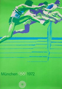
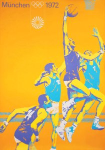
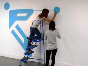
McLaren spoke about the handmade nature of the Munich posters. Much of what is assumed to be a photographic technique was painstakingly artworked by hand. This provoked discussion around one of the key differences between 1972 and 2012. Pre-digital era designers would have to trust to their hand far more. Design was more of a physical activity. As part of the Munich 72 Legacy project an exhibition was mounted. Hans Dieter Reichert worked with current students to mount the exhibition and paint onto the walls the supporting graphics.
Visitors to the exhibition were hitherto unaware of the trials and tribulations the students went through with this new experience of working with their hands, at actual size, in a real three dimensional environment. Even hanging pictures at a consistent height provided a challenge. It was good to hear that the mounting of the exhibition had provided an opportunity for young designers to learn from an older generation. Both generations acknowledged that it was the hand that linked the analogue and digital worlds. Aicher’s own development had been influenced by the students and staff who surrounded him at Ulm. At Ulm Albers, Müller-Brockmann and Bauhaus influences could be encountered. He was also influenced by an attendant philosophy of clarity, simplicity and minimalism. McLaren stated that Aicher’s exposure to Albers’ attitude towards colour influenced the colour application used in the Munich Olympics scheme.
Aicher developed the notion of the book as a format for exploration. The structure and wayfinding nature of the book (with chapters) enabled him to break down a company’s structure and consider its identity.
Aicher and ERCO
This part of the symposium was a video interview between Ian McLaren and Klaus J Maack who had previously been a director at ERCO. ERCO is a company that specialises in architectural lighting. Under the design influence of Aicher, ERCO adopted a grid-based scheme with Helvetica as the corporate typeface. Later ERCO was to adopt Rotis as its headline font. The flavour of ERCO’s visual presence was infused by a particular approach to the photography – the perfect medium for evoking the nature of light. The ERCO identity was informed by the approach that had been taken with the Munich Olympics (and by Aicher’s work with Lufthansa prior to 1972 that Maack had been impressed by). The Olympic identity adopted a ‘sunshine’ motif and the Univers typeface which was light and open. Another strong element of the Olympic visual strategy was the use of colour bars within the cultural series of posters evoking the nature of the German landscape. The bars were use to differentiate this series from the sports posters. The idea of what the Olympics could represent through its graphic representation had been growing from the previous Tokyo and Mexico Olympic schemes. The pictographic ‘matchstick men’ had grown from 21 symbols to 180 symbols. ERCO adopted the development of these symbols and eventually they amounted to 900 in total. The cartography (mapping) was another impressive achievement of the Munich games. Posters were presented on panels that were at 90 degrees angles this allowed for colour combinations to be carefully considered and contrasted from one poster to the other. The ‘posterised’ images with their grain effect were largely done by hand requiring extensive and painstaking hand retouching. The cultural posters used the distinctive banding with superimposed pictorial imagery. These posters were to omit the colour black. There was one controversial exception to this – on the Folklore poster McLaren included black eyes. An argument broke out for which Aicher uncharacteristically stepped in to diffuse the situation ruling in favour of this exception. There were further issues regarding the use of English, an Italian from Brooklyn favouring Americanisms and McLaren holding the flag for pure English. Again McLaren’s view won out.
Tony Brook, Spin: Souvenirs and Studio Culture
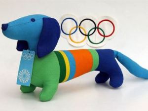
Tony Brook began by indicating one specific influence Aicher had on his own studio (Spin). Brook has adopted Aicher’s studio psychology of no separate rooms and no private conversations – nothing is hidden. For Brook, as with Aicher, the sign of a healthy studio culture is one where the design of the space promotes openness. For Brook there is little room for the hierarchy of status – this is a refreshingly honest approach against the backdrop of a title obsessed design and design education ethos. Brook made reference to and commended the philosophical writings of Aicher and in particular ‘The World as Design’. He cited Aicher as someone who didn’t take the mere title or qualification of someone too seriously. You were either a graphic designer or not. In the 1980s, titles within the profession and design education proliferated. It was no longer enough to be a designer you had to be a ‘middle weight designer’. Within higher education a new strata of management positions have promoted those with an ambition for status without much subject or teaching credibility. They have a worrying amount of power over a discipline and profession they seem to have little regard for. Brook has no time for this nonsense: ‘are you a designer or not?’. Anyone who puts ‘rank before responsibility’ (and there are plenty career minded people who do) should be approached with some caution as to their real motivation in life. In the past subject specialists such as FHK Henrion and Tom Eckersley ran departments that they had some subject and business knowledge of. Eckersley insisted on interviewing all staff and students who applied to join the department. FHK Henrion created courses that were fit for purpose, relevant and based on his lifetime of industry experience. All staff had to have subject credibility. Fred Lambert, educator, editor of Typos and typeface designer proposed an all staff exhibition of work entitled ‘Exposé’. How many of us would fare under the critical treatment of Lambert’s suggestion? Although the 1980s may have seen the rise of the self-important celebrity designer, there were those that resisted such hollow vanities. The design department at Esprit produced business cards with no job titles – ‘it was hoped that this might serve to provoke thinking about the nature of the work one did rather than the status that titles often convey’. Forty years on, the efforts of the Munich designers to prioritise up-to-date and correct information over their own talent is a salutary reminder to a new generation of designers in 2012. Again Mason Wells’ comment that there is no room for the ‘arrogance of youth’ in design rings true. Brook continued on a lighter note to provide the audience with a historical overview of the ‘below the line’ Olympic souvenirs – beer mats, bottle tops, matchboxes and bathrobes all available for the collector of Olympic paraphernalia. The most notable of the Munich souvenirs was the dachshund mascot, Waldi. And the lucky winner of the Munich Olympic themed bedroom is…Tony Brook’s own daughter – lucky girl!
Lucienne Roberts: When Lucie met Otl
Lucie set about establishing her connections to Otl Aicher via a projected wall of visual symbols, which grew in number as she developed her historical overview. Lucie was very much influenced initially by her father’s involvement in design. For Ray Roberts, design was more than packaging the post-war burgeoning boom in capitalism. Design could be a force for good and typography embodied literacy as power. Lucie’s mum was from Vienna where Marie and Otto Neurath developed their Isotype series. Although not directly linked, Lucie made a mental connection between the Isotype scheme and the pictographic language of successive Olympic games. The Munich pictographic scheme was developed by Gerhard Joksch, based on the Tokyo symbols and the sculptor’s armature figure. Through exposure to the Bauhaus and Ulm schools amongst other influences, which also included the British designer and historian Richard Hollis, Lucie developed a taste for the Modernist approach in her own work. The systematised use of typography on a backdrop of modular grid structures and a rationalised use of colour permeated her early work. This wasn’t applied in a dogmatic fashion rather it was tailored ‘in support of the material of others’. There was also the concern for the visual environment and awareness that design could have a secondary role – that of public art, and the street had the potential to be a museum of information.
Mason Wells: Work as Life
Wells provided us with an overview of his development as a designer through various agencies who were known for their appreciation of a certain type of Modernism. Wells had nurtured his taste for Modernist artefacts through his time at Cartlidge Levene, Farrow and North and had the opportunity to put into practice this inherited knowledge. An image of Aicher cycling around the then new Olympic track sparked in Wells the notion of immersing yourself in your work. Design was something that didn’t constrain you to the usual 9-5 job – ‘The World is Design’. Whilst Bibliothéque was in its formative period, Wells had the opportunity to acquire a collection of Munich 72 printed items. So inspired by this acquisition, his partner Jonathon Jeffrey, suggested that an exhibition was the logical conclusion. Mason spoke of Aicher as a conduit for the success of his clients. The books that he’d produce with his clients were a method of recording research and design philosophy in print and making this manifest for the benefit of others.
Panel Discussion
The contrast in German and British standards within design education had been raised previously as a topic for discussion. Inevitably with the composition of this panel (McLaren, Reichert, Roberts, Wells and Brook – all who have experience of the profession and education), it would emerge again. Concern was raised over the undefined notions of what UK students and educators see as ‘creativity’. Wells and Brooks encouraged a more holistic view where the technical and creative are considered in equal measures. Brook in particular reflected upon his company’s increase in employment of non-UK designers in recent years. Could there be something deficient in current UK design education? With all the ‘advances’ in quality assurance, learning and teaching theory and insightful management what could possibly have gone wrong? Perhaps there are lessons from the past that could be applied to the future – perhaps there are still principles worth adhering to. There are some students and educators who do recognise this. Each year high standards are maintained through the annual International Society of Typographic Designers’ (ISTD) student assessment. There were a number of ISTD members and educators in the audience who will reflect upon these thoughts. Unfortunately there were few students in attendance, possibly because it was the end of term, possibly because the venue was outside of London, but this was disappointing all the same.
There was discussion around whether the graphic scheme for 2012 developed by Wolff Olins was indeed a worthy effort in terms of the legacy of past design. Many thought it had suffered from the ‘design by committee’ approach mixed up with a rather middle-aged view of what ‘designing for the kids’ meant. Concern was expressed as to whether, still in the UK, there is a lack of respect for the designers’ role and the value of design. The panel overall thought the current graphic scheme was rather conservative and lacking in the role of chance. It is possible to combine the necessary order that information design requires with a sense of humanity that communication demands. The Munich Olympic graphic scheme will perhaps be remembered for engaging the spirit through its exuberant imagery and informing through a controlled system of typography. The stubbornness of Aicher in maintaining a high and consistent standard of design with his team has earned the respect of subsequent practitioners. The scheme established 40 years ago has proven to have enduring appeal and acts as a key reference point for the future.
Postscript
Some of my students made a trip to see the related exhibition and commemorated their day with a poster design celebrating the food-based joys of being a tourist. The first image is by Henrietta Ross and the second by Sharon Mah.




Baseline 5:30 pm on August 21, 2012 Permalink |
Pretty accurate Tony. I am glad that we got the symposium and exhibition together. The students enjoyed the experience of helping to create the wall graphics and the organisation of the hanging of the exhbition itself. Thanks for your blog. HDR